Fundamentals of Data Visualisation
- Exploratory Data Analysis
- Communicating results
- Rule n.1: Start with why, and who
- Rule n.2: Don’t lie
- Rule n.3: Reduce the noise, amplify the signal
- Conclusions
- Additional material
Visualising data is all too often an overlooked skill of data people, especially by the data scientist/machine learning engineer fraction of the population.
This is somewhat similar to what happens with the front end/back end divide in software engineering. Just as I don’t believe in true full stack engineers, because the amount of tools and speed at which they evolve is simply too much for a single person to master at the same time, I don’t believe that it is reasonable to expect a single data professional to be an expert in all the aspects of the data process.
At the same time, I do believe that software engineers who can cover the fundamentals of full stack development while maintaing a deeper expertise in some aspect or another exist, and I call them good software engineers. In the same fashion, I think that good data professionals should have a good working understanding of all the steps of the data process no matter whether they are generalists or hyper specialised.
This is especially true for data visualisation as it is fundamental in at least two very distinct stages at the opposite ends of the data process, so I believe it is very relevant to all data professionals.
Exploratory Data Analysis
When we first look at our data, looking for patterns, and trying to spot problems, it is important to be able to observe our data from all angles.
Data visualisation is a powerful tool to grasp multidimensional information. In simpler words, it is a way of squeezing a lot of data into a container small enough for our brain to appreciate and spot the patterns. As they say “a picture is worth a thousand data points”.
Summary statistics and centrality measures can serve the same functions, but they are rarely enough, unless we can afford to make a lot of assumptions on about the shape of our data.
Furthermore, summary statistics can easily hide problem.
Let’s look at one quick example.
A simple dataset is composed of two numerical variables (X and Y) with the following statistics:
Mean of X = 54.26
Mean of Y = 47.83
Standard deviation of X = 16.76
Standard deviation of Y = 26.93
Correlation = -0.06
Just looking at this numbers, the dataset looks utterly uninteresting, but this is what the dataset looks like as a scatterplot:

Just to push the point further, these are a series of datasets that have all exactly the same statistics, but as you can see look very different.

If you want to learn more about the datasaurus origin and its evolution into a “datasaurus dozen” (notice that we are actually looking at 13 different datasets), have a look at this excellent article.
Communicating results
The ultimate goal of using data, so the very essence of the job of a data professional, is to inform decisions with what the data is telling us. No matter what amazing insight we have gained from our data, if we are not able to communicate it, it will be worthless. Even worse, if the insights are incorrectly communicated, they might create more damage than if they hadn’t been spotted at all.
Good data visualisations help conveying a message, since they can reduce the noise and focus the attention on whatever insight the author of the visualisation is trying to communicate.
Exploratory data analysis is a huge topic in itself, so here I want focus on this step, the communication of insights, and will look at what I consider three fundamental rules to pay attention to.
Rule n.1: Start with why, and who
This is really the first rule of any kind of presentation, not only data visualisation.
Data visualisation is not (or should not be) a pretty picture for its own sake: it is made to communicate something to someone. It is fundamental when creating visualisations to start and always keep in mind both the message and the intended audiance.
A good exercise is to explicitly articulate why the visualisation is being made before actually building it. It is very unlikely we will be able to convey a message we are not able to articulate to ourselves.
Even if the message is extremely clear, there is no single way of building a visualisation. Context and audience matter. A lot.
A cautionary tale
On the morning of the 27 of January 1986, NASA managers of the Marshall Space Center were having a teleconference to address concerns about a Shuttle launch that had been rescheduled from that morning to the next day because of weather issues.
Among other things, they were addressing concerns that the engineering team at Morton Thiokol Inc., the company that had produced the solid rocket boosters of the Shuttle, had about the effects that the cold temperatures forecasted for the next day might have on the O-Rings of the boosters.
The engineers at MTI presented this chart to illustrate their concerns on the topic:

At the time NASA hadn’t been recommended anything explicitely (this would happen later in the afternoon), as per later testimonies, they were just “looking at the engineering data”, so they decided that those concerns were negligible and went ahead with the launch.
The next day the Challenger launched as scheduled.

Although it has been speculated, it is probably not the case that the low temperature has been the main cause of the disaster, so it’s an exaggeration to say that bad data visualisation has destroyed the Challenger, but it is quite clear that the chart above does not bring the message across.
There are a number of capital mistakes, but to stay on topic of rule n.1, if you want to show the risk of damage to the O-Rings deriving from low temperatures, then:
- Don’t make the temperature hard to read: that’s the main reason you are making this visualisation
- Don’t hide the legend that clarifies the damage to the O-rings in another slide: you are hiding your message
- Don’t sort by time: it’s irrelevant here, and it is shifting the attention from the message you are trying to convey
And on the topic of “know your audience”: that chart has been prepared to be shown to NASA management deciding on the safety of a launch, not on a magazine for the general public, you really don’t need all those rockets boosters pictures.
As Tufte (famous statistician and data vis expert) has possibly overemphasized, the message “low temperatures can damage the o-rings more than we feel confortable with” might have been better served by something like this

(Image coming from this Stanford magazine article)
Whatever the correct way of displaying the message is, in the original chart you can spot a huge red flag in the lower left corner, that reads:
Information on this page was prepared to support an oral presentation and cannot be considered complete without the oral discussion
Whenever you spot a warning of this kind, it is often a sign that the authors don’t feel confident about their presentation or data visualisation or don’t want to assume responsability for that. Try not to be that author.
Rule n.2: Don’t lie
Since any single element of a data visualisation explictly or implicitly carries meaning, there are also countless possibilities of lying with it.
When I say “lying”, I mean it in a broad “creating a wrong interpretation of the data in the audience” kind of way, as it does not need to be intentional.
Since every data visualisation should have a clear message and intended audience, there are a number of ways of distorting that message.
Rather than talking in abstract about how not to lie, I find more useful to look at examples of lying charts. Whether the author intended to do that or not.
A menagerie of lying charts
Lying with data and scales
The first and most obvious way of lying with a data visualisation is by manipulating or omitting the data itself. Take a look at the following graph, that shows how the pollution has dropped since a certain party has taken power (the country and party are not important in this context).
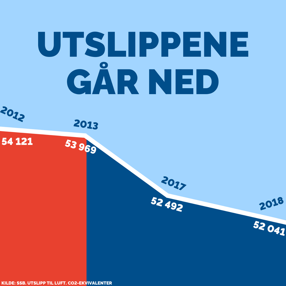
Of course a distracted voter would not notice that three years (when pollution actually went up) are missing from the chart.
Also notice that the same chart pulls the old trick of “let’s remove the 0 from the y axis so that a 2% change looks like a reduction of more than 50%”. Two lies for one.
As I said, lying with charts does not need to be intentional: speaking of y axes and scales, you can also err in the opposite direction, by being too honest and mixing quantities that should not be on the same scale.
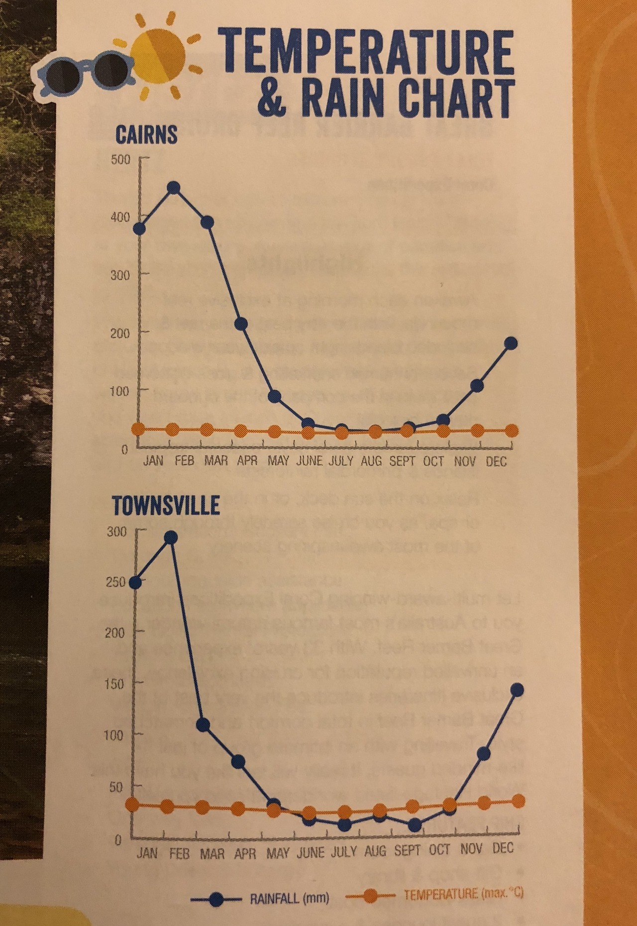
The result is a chart that is technically correct, but does not convey any useful information (at least for what concerns the temperature).
Lying with mappings and aesthetics
Next on our list are the so called “mappings”, i.e. the way we project dimensions of our data (the features, if you will) onto the characteristic of the graphical objects of the chart (the “aesthetics”).
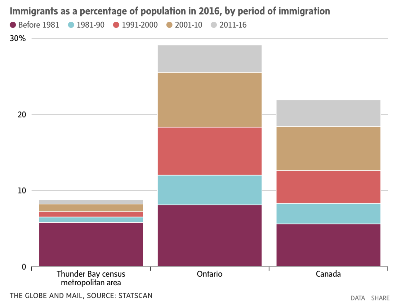
As usual, this can be clumsy/unintentional, like mapping an ordinal variable like binned years onto a non gradient color palette of a stacked bar chart, resulting in a chart that is definitely not easy to read (at least in the temporal dimension):
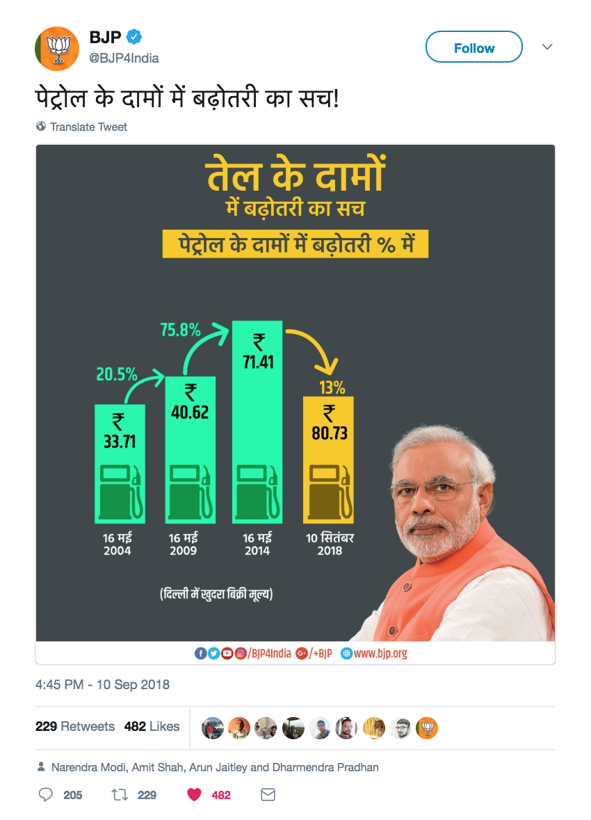
Or it can be absolutely blatant, like using a bar chart and implying a mapping that is not there, pretending that the mapped feature is represented by the height of the bars (which is clearly not the case)
Or it can be more sneaky, like mapping an ordinal variable onto an ordinal aesthetic (the position on the x axis), but sorting it according to something else, effectively treating an ordinal variable like a categorical, non ordered, one. Notice how the days on the x axis are not in chronological order, to make a decreasing trend appear out of thin air.
One of the most common way of lying with aestetics, which is mostly uninententional, is to use the wrong colours. Picking the right colours for your data visualisation is no easy task, but one rule of thumb is: never use the rainbow colour palette.
There are a lot of reasons for this, but the summary is that it has unintuitive hues shift (and we subconsciously associate meanings to colours) and that it can have similar hues for values that are actually far away on the scale. As an example, look how similar the pink and red hues (which are at the opposite ends of the scale) are in the following chart.
Lying with geoms
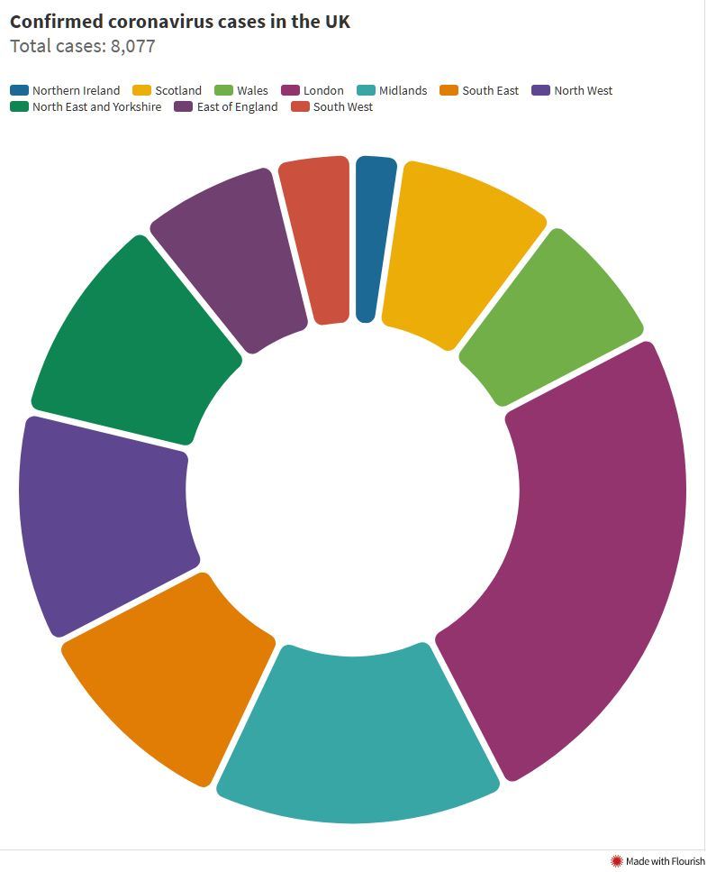
Next element that can be used to make a lying data visualisation is the choice of geometric object (or “geom”, in the language of the grammar of graphics). By far the most common offender is the use of a pie chart (or even worse, a donut chart) for categorical variables with a lot of categories.
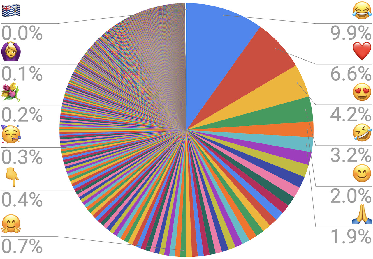
Although there is some controversy on this point, the reason why pie chart should be avoided is that they use angles to represent quantities, and the human eye is very bad at estimating angles. This problem is exacerbated with donut charts, where the missing central circle makes understanding the quantities even harder. In general, a pie chart should only be used for no more than 2-3 categories, when the quantities are very different and the actual numbers are explicitly presented or only a rough comparison is needed (and as said before: your visualisation should be able to stand on its legs, having to write down the actual data is a red flag). Dount charts and gauges should only be considered eye candy for raw values.
On the other hand, if you really want to make it nigh impossible to evaluate quantities, using a 3D pie chart is a great ways to distort the sizes of the slices to make comparisons look whatever you want them to look.
In general the addition of 3D to a visualisation is always a bad idea, as it adds nothing and often actively distorts the message.
Let it be noted that I blame MS Office for the all too frequent presence of 3D charts.
Wrong geoms are not restricted to 3D and pie charts though: in the following graph, for example, the choice of a line plot implies the presence of a trend among independent categories (on the x axis we have a categorical variable, not an ordinal one). Line plots are very useful for ordinal vairables and especially time variables, but not in this case.
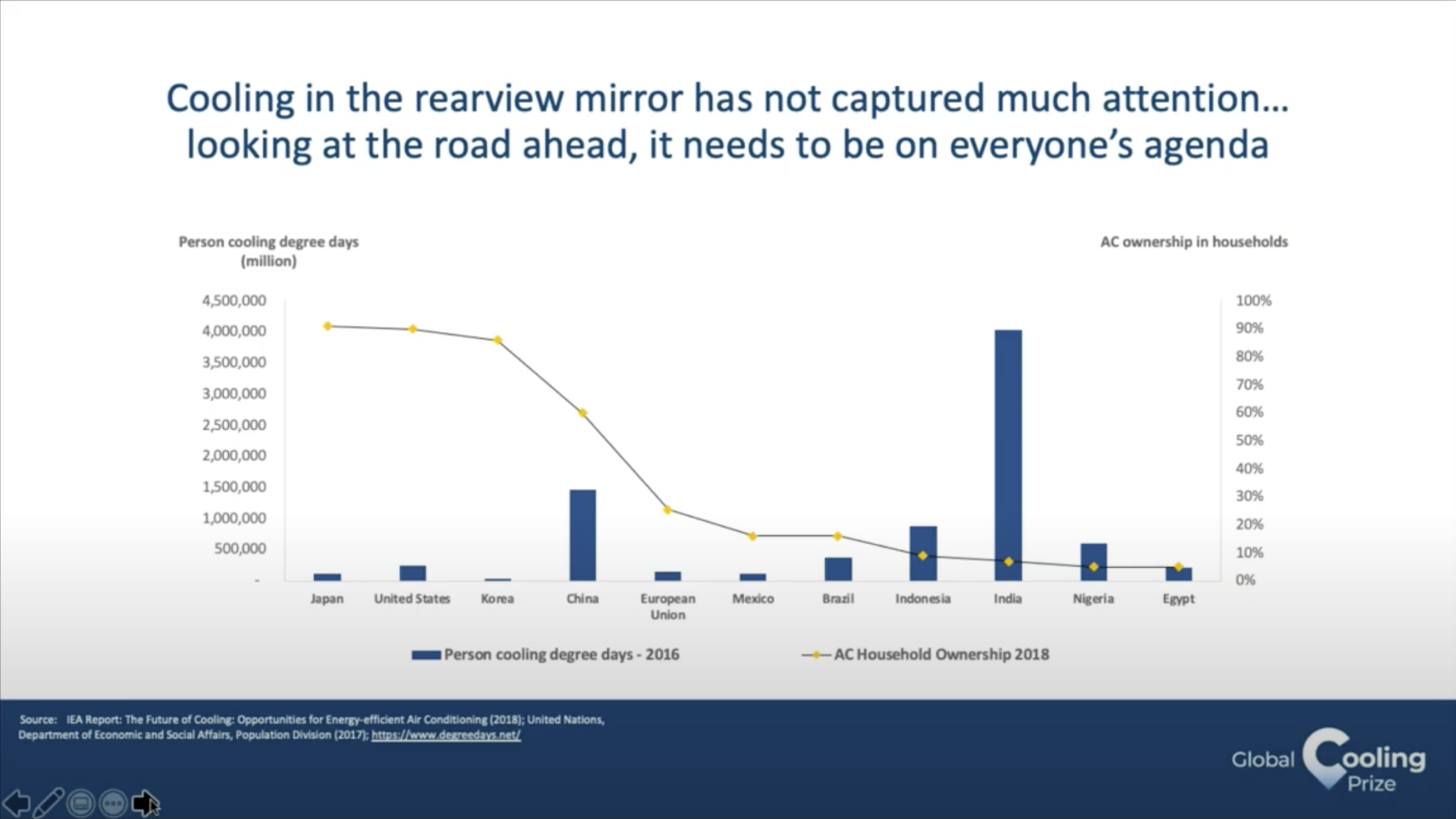
Notice that in the chart there is no real mistake, but the line suggests a relationship between cities that are close on the x axis, while they are just sorted by the percentage of AC ownership in households.
Another common class of lying geoms is pictograms in infographics. The problem here is that more often than not we see the underlying variable mapped to the radius of the picture, while looking at pictures we instinctively compare the areas, which go with the square of the radius. Notice, for example, how in the following infographics, in the “Skipping breakfast” section a bowl which is four times larger than the one next to it is used to represent a quantity that is roughly twice the other.

A better solution is actually used in the “office romance” section (second to last) of the same infographic, where the dimension is mapped onto the number of copies of the same picture. Less visually appealing for sure, but more truthful. An alternative solution would be mapping the variable to the actual area of the picture, but that makes the comparison harder to make (because we are worse at comparing areas), unless the quantity itself is an area.
Good infographics are tricky to make.
Lying with other elements
If you really do not want to lie with the chart itself, you still have the possibility of using the additional elements, like labels, scales, legends and so on.
This is often done by omission.
I am pretty sure that “label your axis” is a mantra that we have all heard at school, but what better way to produce a visualisation that has really little explanatory power, but gives a sense of “backed up by data” to what is effectively a marketing ad?
Another possibility is to put the legend far away from the actual chart, so that the eye constantly has to go back and forth before essentially giving up. For maximum effect, remove any number, sort the legend in an imperscrutable way, adopt a colour palette that has several similar hues for unrelated categories and, of course, use a donut chart for many similar quantities.
Or if you really, really want to go overboard, add a messed up mapping, and you have successfully achieved The Sun level of data visualisation
"Is 34 bigger or smaller than 14?"
— Arieh Kovler (@ariehkovler) June 9, 2017
"Smaller. Definitely smaller"
"What about zero?"
"Zero's a bit less than 34 but it's much more than 22" pic.twitter.com/qWkC7rkK2l
Important: Unless you really know what you are doing, avoid pie charts and donut charts and avoid the rainbow colour palette. Pay attention to all the elements of your data visualisation.
Rule n.3: Reduce the noise, amplify the signal
Edward Tufte, whom I have mentioned while talking about the Challenger disaster, coined the term “Chartjunk” to refer to all the unnecessary elements of the chart that distract from the data itself. “Maximising the the data-ink ratio” is one of Tufte’s rule, by which he means that we should consider reduce as much as possible all the “ink” (this was an era when data visualisation tended not to sit on a screen) that is not representing the data. This is a very good rule of thumb, and in the process of developing a good aestethic for effective data visualisation I strongly advise to practice the art of minimalist charts. The problem is that this can easily go too far if followed to the letter. The idea behind my 3rd rule is to remove whatever distracts and add whatever conveys the message. It is true that we should let the data speak for itself, but data has a very faint voice, and we should make sure that its whisper is heard loud and clear.
The following is often found as an example of bad visualisation, due to the very low data-ink ratio and the amount of chartjunk.

I actually disagree: this is a visualisation made for a Time magazine issue dedicated to the price of diamonds. Its message is extremely clear (the price of diamonds has fallen), and its intended audience are the readers of Time magazine, not diamond traders; in this case even the actual numbers are probably not that important, if not to convey some sense of scale.
The visualisation clearly conveys the intended message to the intended audience and does so capturing the attention in a way more effective way than a boring and clean chart would have made. As such, I consider it an excellent storytelling data visualisation.
Conclusions
Data visualisation is a vast field (in which I am not an expert) and a deep rabbit hole to look into, but I hope to have been able to condense into my three rules some simple fundamental principles that can help you making good data visualisation independently of your role, experience and tools of choice. I find that these set of rules are a useful lens that help me understand the thinking behind a lot of what I read on the topic, which at the same time, makes it easier to learn. Hopefully it will work for you too.
M.
Additional material
If you want to delve deeper into the topic, I suggest to have a look at the following material, in no particular order. No affiliate links.
- Same Stats, Different Graphs: Generating Datasets with Varied Appearance and Identical Statistics through Simulated Annealing the paper about the “Datasaurus dozen”
- Edward Tufte’s website. Tufte’s a recognised name, although a bit extreme in his views sometimes.
- On the subject of finding the “why” and “who” of data visualisations the booklet Making Data Visual presents the interesting concept of “data interview”. I think it is a nice little read.
- viz.wtf your daily dose of graph “mistakes”, most of the examples I used are coming from this website
- A very good and detailed Medium article on visualising data in high dimensions, with a lot of good advice
- Visual storytelling with D3, although specifically aimed at D3.js, the author is one of the data journalists behind the excellent visualisations at 538 and the book contains a lot of general good advice
- A discussion on when “eliminating chartjunk” can go too far (this is the reason behind the “amplify the signal” part of rule n.3 we have talked about). And a sensible improvement on Tufte’s definition of chartjunk
- The original paper on the layered grammar of graphics, which has given us
ggplot. Extremely useful to understand what data plots are from a technical points of view and to get the hang of the best plotting libraries. From the same author of the Medium post on the visualisations of high dimensional data, we have one specifically on the same topic, but specifically aimed at explaining the grammar of graphics approach. Very useful even if R and ggplot are not your thing - The podcast Data Stories and in particular the episode dedicated to colours. Although it is not superexciting, the podcasts contains a lots of gems
- The Data Science Design Manual (free to download from Springer’s website for the time being). And in particular the chapter on exploratory data analysis and data visualisation. The whole book is a bit dated in its views in my opinion, but it is a good organised review of the data process
- Darrell Huff’s How to lie with statistics a classic and a must read for every data professional
- More specifically dedicated to data plots, How to lie with charts